React JS App: styling
ReactJS styling SCSS
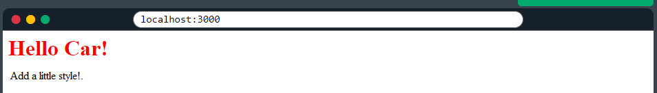
1 Overview
📘 styling Sass is a CSS pre-processor. Sass files are executed on the server and sends CSS to the browser.
SCSS (Sassy CSS) is a CSS preprocessor, which means that it adds additional features to CSS that allow you to write more powerful and efficient stylesheets. SCSS is an extension of the CSS syntax, and uses the same structure and principles as regular CSS, with a few additional features.
One of the main advantages of SCSS is that it allows you to use variables in your stylesheets. This means that you can define a value once and use it multiple times throughout your stylesheet, which can make it easier to maintain and update your styles.
2 Install
3 Create a sass file
Create a Sass file the same way as you create CSS files, but Sass files have the file extension .scss
In Sass files you can use variables and other Sass functions:
SCSS also supports other features, such as mixins, nested rules, and functions, which can make it easier to write and maintain complex stylesheets.
Import the Sass file the same way as you imported a CSS file:
index.js
index.js, <Header /> component and importing mycss.scss4 Tailwind
References:
TailwindCSS is a utility-first CSS framework that focuses on providing a wide range of pre-built classes for building responsive and customizable user interfaces in React. With its intuitive class-based approach, developers can rapidly prototype and style components, achieving consistent and clean designs.
Tailwind also offers a wide range of utility classes for spacing, typography, colors, and more, giving developers fine-grained control over their UI.
It’s highly configurable and optimized for performance, making it an excellent choice for modern React projects.
5 Semantic
SemanticUI React is a library that brings theSemanticUI framework’s elegant and intuitive design language to React applications.
It provides a set of reusable components that are fully responsive and accessible out of the box. With Semantic UI React, developers can quickly build beautiful and consistent user interfaces with minimal effort.
The library supports theming and customization, allowing developers to adapt the UI to their specific project requirements easily. Semantic UI React follows best practices for React development and integrates seamlessly into React applications.
6 Material
Material-UI is a popular React UI library that implements the Material Design principles developed by Google.
It offers a comprehensive set of components, icons, and styling options to create modern and visually appealing user interfaces. Material-UI’s components are highly customizable and can be easily themed to match any design requirement.
The library provides a rich set of features, including responsive layouts, form validation, animations, and transitions, making it a versatile choice for building React applications with a polished and consistent look and feel.
7 w3-css
W3.CSSfor React is an integration of the lightweight W3.CSS framework into React projects.
W3.CSSoffers a collection of CSS classes that provide a solid foundation for building responsive and modern user interfaces. With W3.CSS for React, developers can leverage the simplicity and ease of use of the W3.CSS framework within their React applications.
The framework emphasizes simplicity and minimalism while offering a range of utility classes for styling elements and creating responsive layouts. W3.CSS for React is a lightweight option for developers who prefer a lean and straightforward CSS framework for their React projects.
8 bootstrap
References:
Bootstrap for React is an integration of the popular Bootstrap framework into React applications.
Bootstrap provides a robust and comprehensive set of CSS and JavaScript components that enable developers to quickly build responsive and mobile-first user interfaces.
The React version of Bootstrap provides React components that encapsulate Bootstrap’s functionality, making it easier to integrate with React projects.
With Bootstrap for React, developers can take advantage of the extensive documentation and community support available for Bootstrap, making it an efficient choice for building feature-rich and visually appealing React applications.